Work
Olo
Service: Brand Design, UI Development
Sector: Restaurant Tech Industry
Year: 2021-2023
Website: olo.com
Overview
I joined the Marketing team at Olo in 2021 as Senior Associate Brand Designer after the acquisition of Wisely. Despite the challenges posed by the acquisition and the transition from a startup to a public company, I was able to make an immediate impact on the Marketing team and played a key role in merging the Olo and Wisely identities into the new parent brand by building, from the ground up, the new marketing website and designing solutions for 700+ employees, while supporting different teams with the creation of decks, collateral, guides, videos, ads, campaigns, templates. My contributions were instrumental in helping the company establish its position as the leading engine of hospitality in the industry.
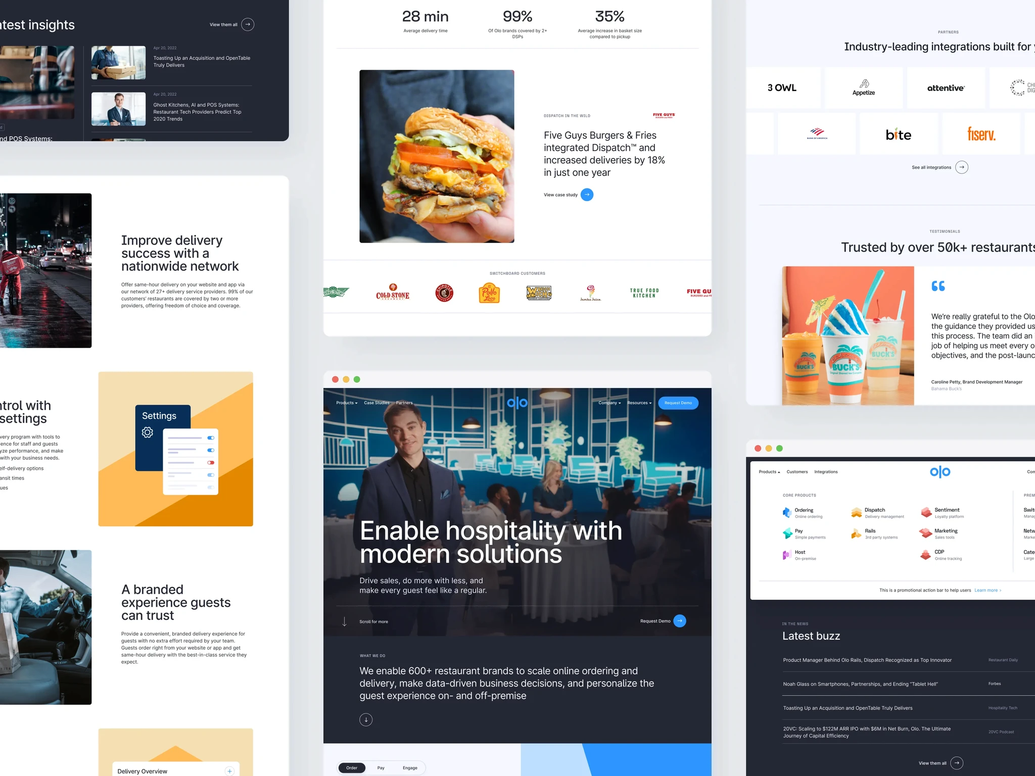
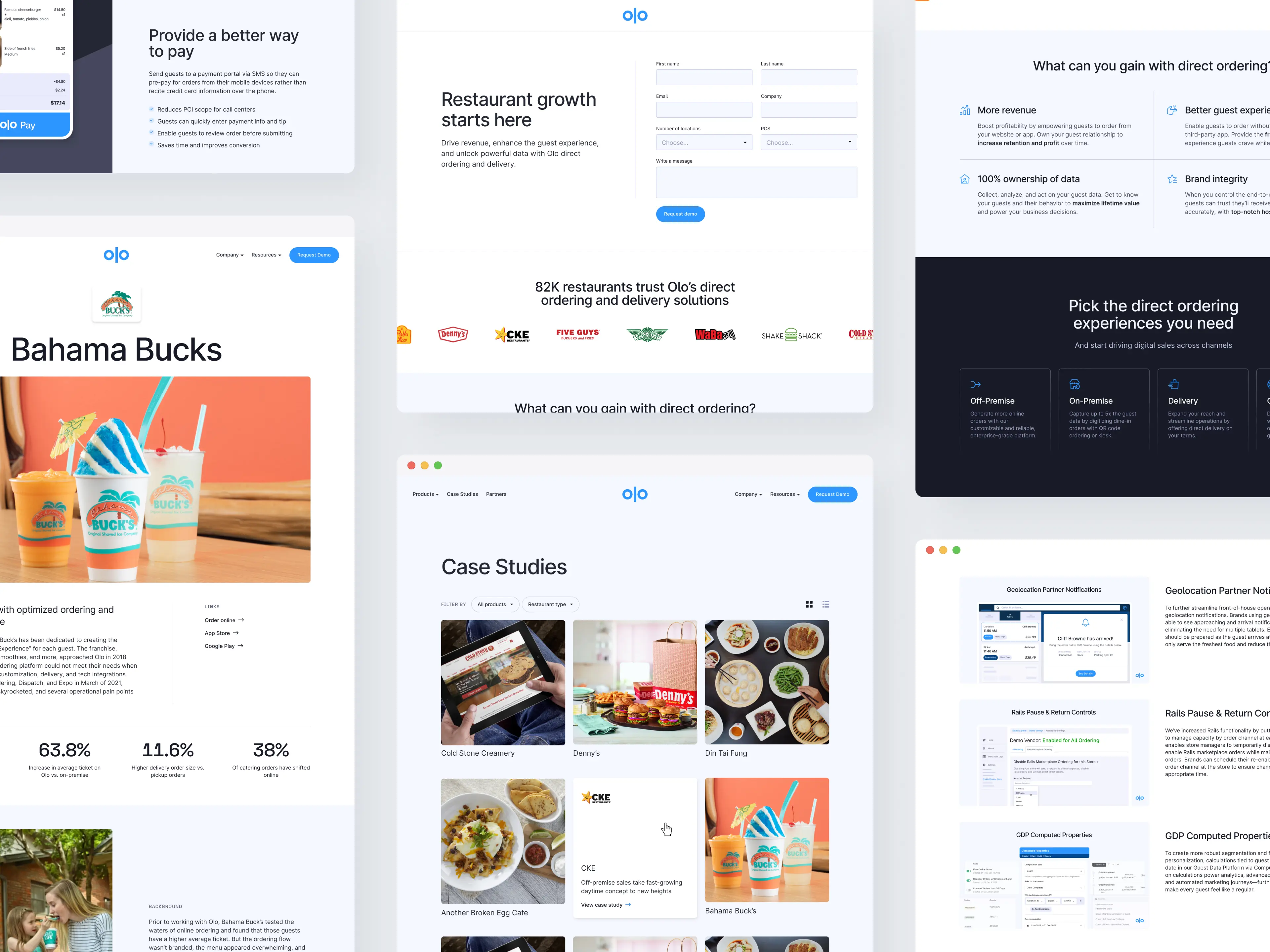
01. Website
After a successful rebranding in 2021, I was responsible for building and maintaining the new website and blog in Webflow. My primary focus during this process was on building pixel-perfect landing pages, optimizing the website for SEO, ensuring accessibility, and enhancing performance.
To maximize the website's visibility and reach, I implemented SEO best practices, including optimizing meta tags, keyword research, and improving site structure. By doing so, I aimed to enhance organic search rankings and increase the website's visibility in search engine results.
In addition, I prioritized accessibility throughout the website development process. I adhered to web accessibility guidelines and standards, ensuring that all users, including those with disabilities, could navigate and interact with the website effectively. This involved optimizing color contrast, implementing alt text for images, providing alternative navigation options, and considering user experience from an accessibility standpoint.
Moreover, I focused on optimizing the website's performance to deliver a fast and seamless user experience. This involved optimizing page load times, minimizing server requests, and utilizing efficient coding practices to enhance overall performance.
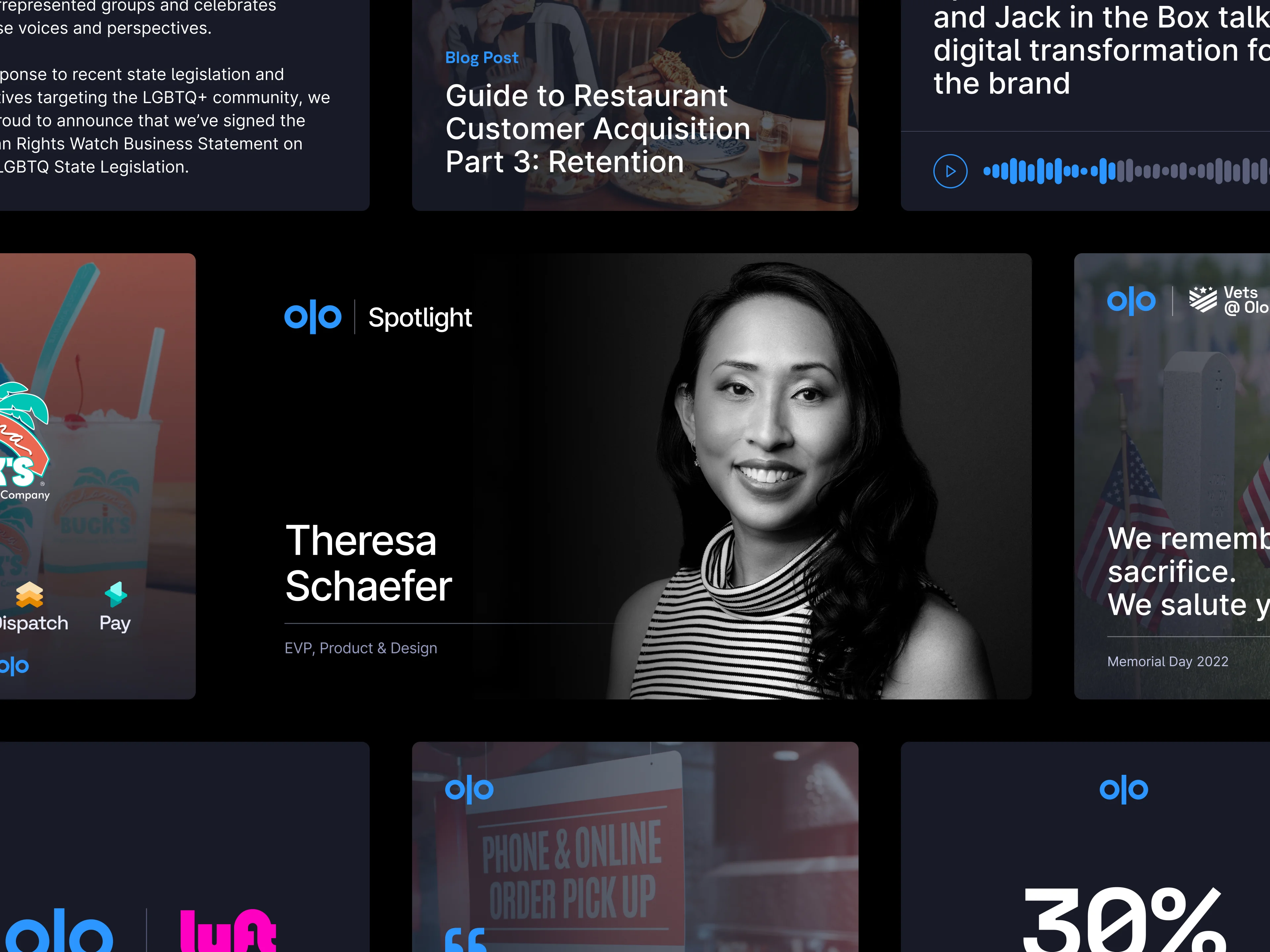
02. Social Templates
As part of the same rebranding, one of my key responsibilities was designing a new set of social templates to be utilized across the company's primary channels: LinkedIn, Twitter, and Facebook.
The primary objective of this task was to create templates that were both consistent with the brand identity and distinct enough to maintain a cohesive and on-brand social media presence.
To achieve this goal, I embarked on a creative process that involved analyzing the new brand guidelines and identifying key visual elements that represented the brand's identity. I carefully considered the brand's color palette, typography, imagery style, and other design elements to ensure consistency across all social media templates.
Throughout the design process, I collaborated closely with the marketing team to understand their specific requirements and incorporate their feedback. This collaborative approach ensured that the final social templates not only met the branding objectives but also aligned with the company's social media strategy and goals.
By designing a set of social templates that struck the right balance between consistency and differentiation, I contributed to establishing a strong and unified brand presence across the company's main social media channels. These templates provided a cohesive visual identity that helped reinforce the brand's message and fostered recognition among the target audience.
03. One-pagers, guides, sales collateral
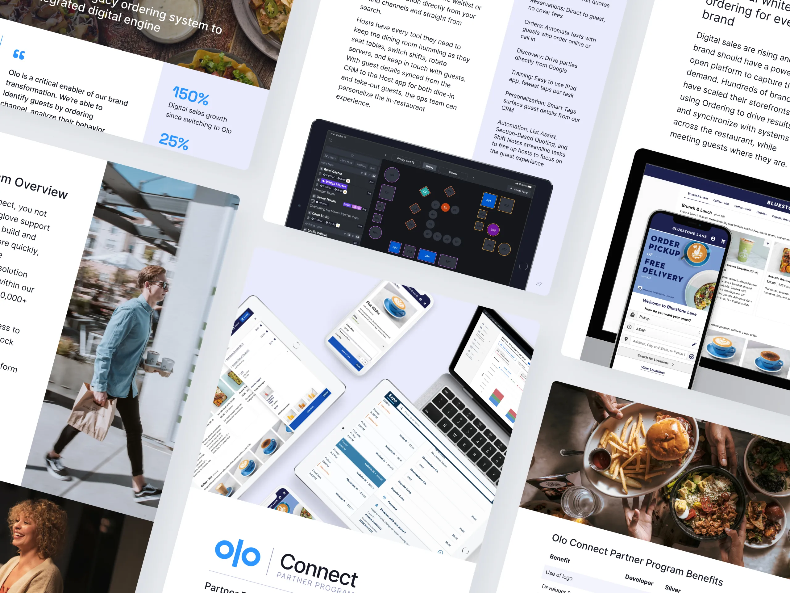
As a member of the Marketing team, a significant responsibility entails designing various materials that can be utilized by the Sales team to effectively promote and sell the product. These materials serve as comprehensive resources, providing a 360-degree overview of the key selling points and advantages in comparison to other competitors.
The design materials created include sales presentations, pitch decks, product brochures, case studies, whitepapers, and other visual assets. Each piece was crafted meticulously to convey information clearly, highlight key features, and illustrate the product's benefits in a compelling and persuasive manner.
By employing a combination of persuasive copywriting, visually appealing graphics, and strategic use of branding elements, I ensured that the materials were consistent with the overall brand identity. This consistency helps build trust and recognition among the target audience, reinforcing the brand's reputation and credibility.
Moreover, I collaborated closely with the team to gather their feedback and incorporate their input into the design process. This iterative approach ensures that the materials effectively address the needs of the sales representatives, empowering them to present the product with confidence and conviction.
04. Slide templates
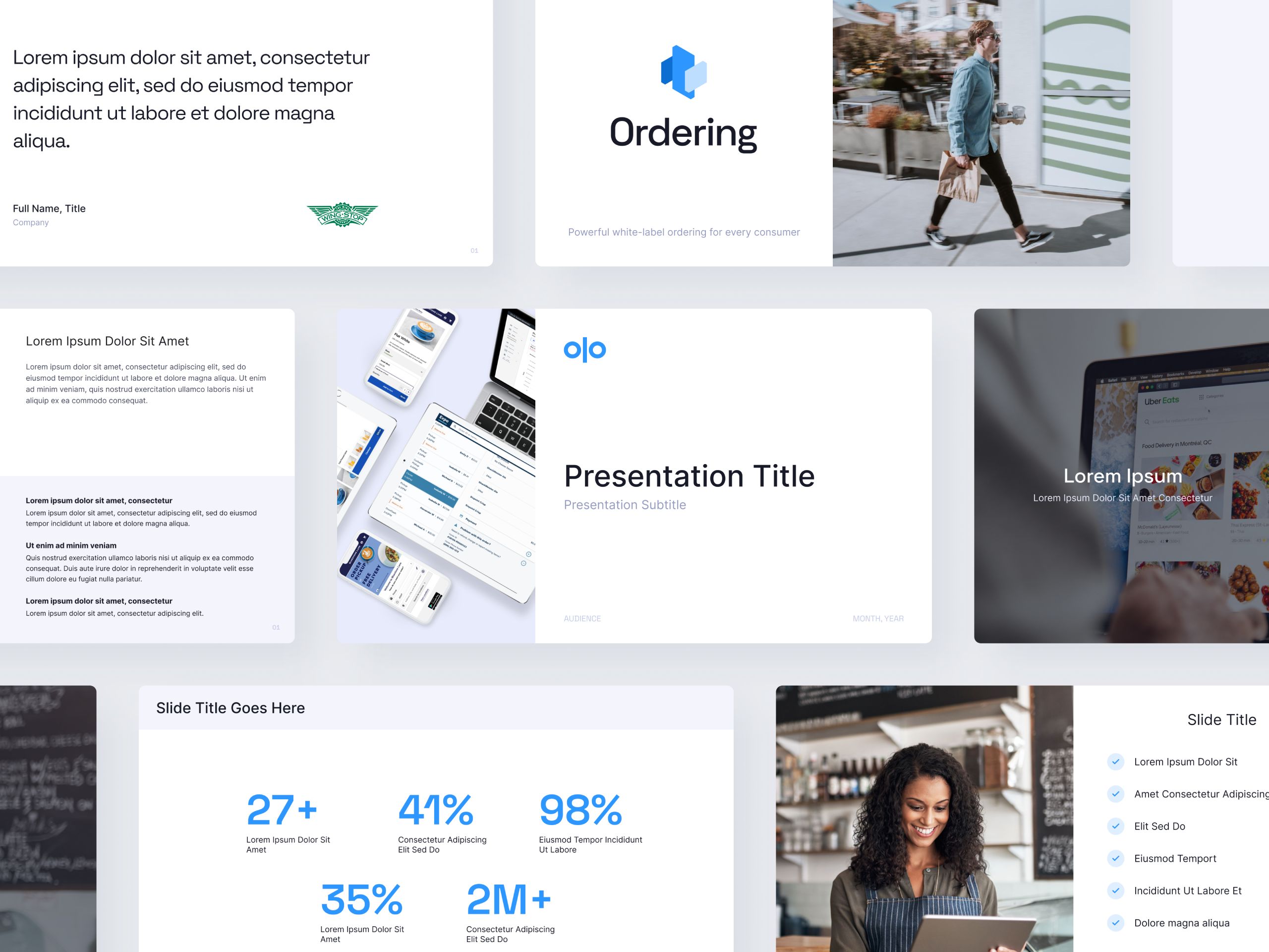
A crucial goal of this redesign was to create a cohesive and adaptable set of slides that could cater to the diverse needs of the company's 700+ employees.
Regardless of the specific content or target audience, these slides needed to provide a flexible foundation for creating compelling presentations.
The result of this concerted effort was a resounding success throughout the entire organization. Multiple teams across various departments were able to leverage the newly designed slides to produce high-quality content for a range of purposes.
Whether it was crafting engaging pitch decks to win clients, preparing impressive RFPs, or creating impactful presentations for events, the new templates empowered employees to deliver their messages effectively.
In addition to providing a consistent visual identity, the rebranded templates came with detailed guidelines and assets.
These resources not only ensured that each presentation adhered to the company's brand guidelines but also equipped every employee with the necessary tools to produce exceptional slides.
05. Email templates
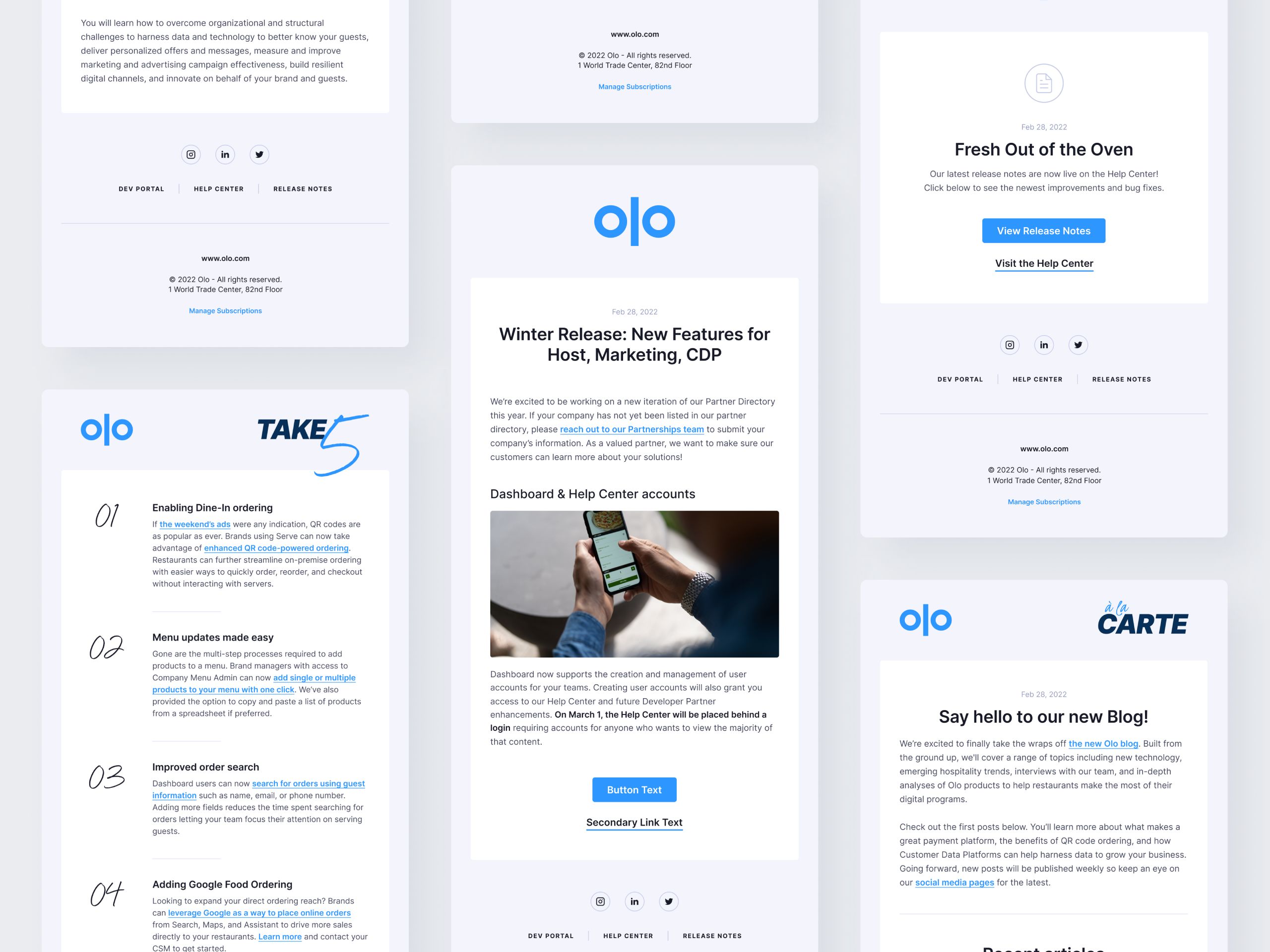
These templates serve a wide range of purposes, including company announcements, campaigns, newsletters, and product updates. Recognizing the importance of consistent and visually appealing email communication, I had to design a new set of templates that would cater to all these content types.
To accomplish this, the templates were built from scratch in HTML/CSS using HubSpot. By leveraging the dynamic nature of these templates, the team could easily customize and tailor the emails to suit the specific needs of each communication.
To ensure the templates delivered a seamless experience across various email clients, extensive testing was conducted. Over 800 tests were meticulously executed to verify the compatibility and visual consistency of the templates across a wide array of email clients.
This meticulous attention to detail resulted in visually appealing emails that rendered consistently and flawlessly across a wide range of platforms and devices.
06. Ads, banners, events
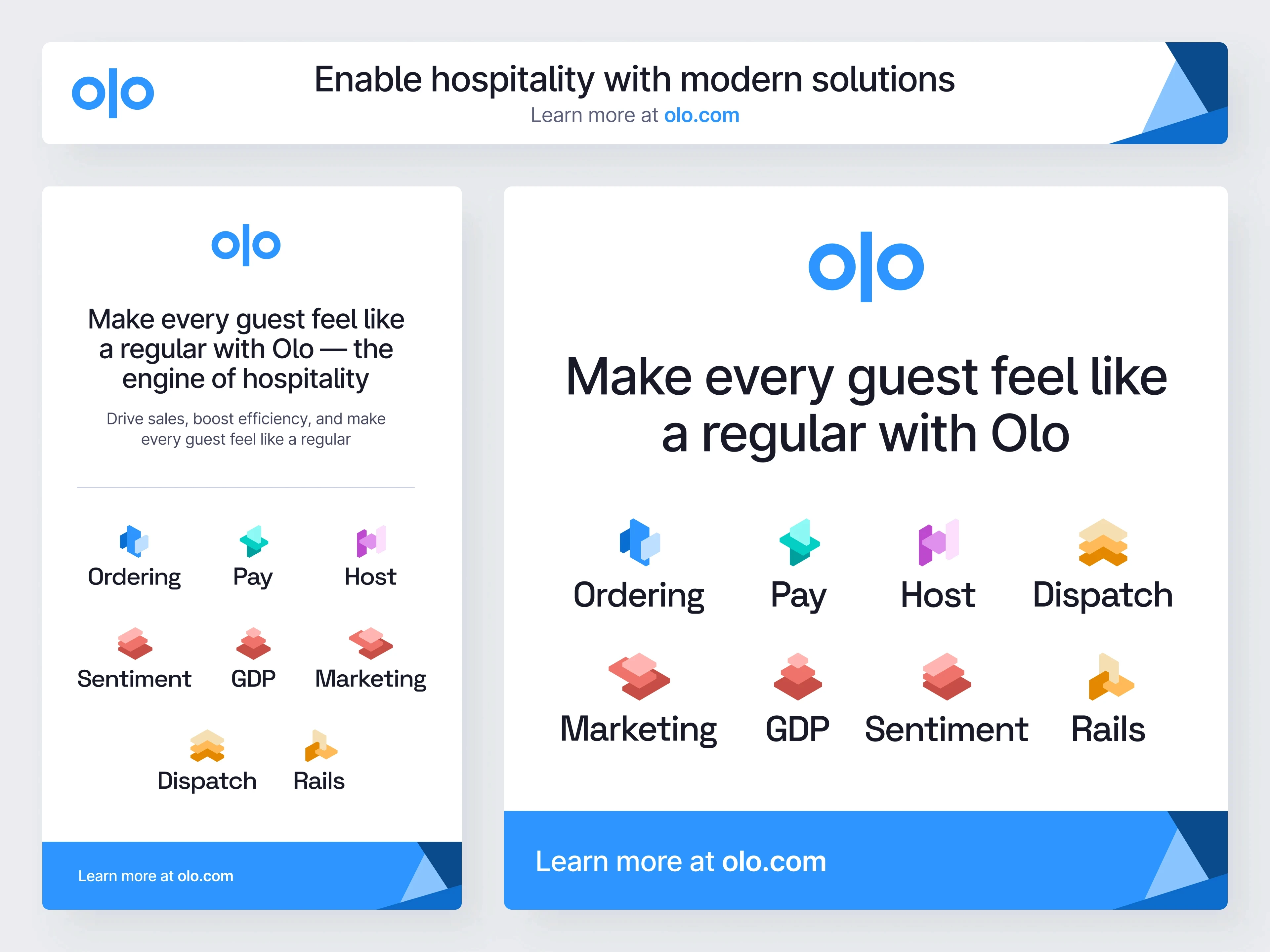
One of my primary responsibilities involved designing visual elements for various marketing channels, including digital ads, printed banners, and materials for in-person events. This encompassed creating visually compelling assets that effectively conveyed key messages and captured the attention of the target audience.
Printed banners played a crucial role in promoting the brand and its offerings in physical spaces such as trade shows, conferences, or retail environments. By utilizing attention-grabbing designs, impactful visuals, and clear messaging, I aimed to attract the audience's attention and generate interest in the brand.
Throughout the design process, I collaborated closely with cross-functional teams, including marketing strategists, event planners, and brand managers. By understanding their specific requirements and aligning the visuals with the overall marketing strategy, I ensured that the designed materials effectively represented the brand's identity, key messages, and objectives.
More work
(1)
